Psychology on the Shelf: Choosing the Perfect Palette for Your Bread Boxes
Color shapes how we feel before we even taste the bread. It guides buying choices in quiet but strong ways. When you choose the right palette for bread boxes, you build trust, comfort, and desire at first sight.
The Silent Language of Color in Food Packaging
Color speaks faster than words. When shoppers walk into a store, they scan shelves in seconds. Their eyes move toward shades that feel safe and familiar. Bread sits close to daily life. Therefore, its packaging must feel warm and honest.
Brown tones often suggest earth and grain. They remind buyers of farms and fresh flour. Green signals health and natural choices. It connects to fields and clean ingredients. Meanwhile, soft cream shades feel simple and pure. They reduce visual stress. As a result, customers feel calm.
Bright red or neon tones may grab attention. However, they rarely suit bread. Such colors feel intense and artificial. Bread is comfort food. It needs colors that reflect warmth. So, muted shades often perform better.
Research in consumer psychology shows that people link color to taste. For example, golden hues suggest crisp crust and rich flavor. Light beige suggests softness inside. When the outside color matches the expected taste, trust grows.
In addition, cultural meaning matters. In many regions, white suggests purity. In others, it may suggest emptiness. Brands must study local behavior. Smart color choice reduces confusion and builds loyalty.
As an expert in packaging research, I have seen small color shifts change sales results. Even a darker brown can make a product look premium. Therefore, brands should test shades carefully. Color is not decoration. It is a strategy.
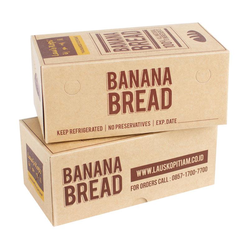
Warm Tones and the Feeling of Freshness
Warm colors connect strongly to bread. They mirror the baking process. Think of the oven glow. Think of golden crust. These images create comfort in the mind.
Orange and golden yellow suggest warmth. They also suggest freshness from the oven. When customers see these shades, they imagine aroma. That mental image can trigger hunger. As a result, purchase intent rises.
Soft terracotta can also work well. It feels rustic and handmade. Many artisan brands use it. This shade tells a story of tradition. It feels less industrial. Therefore, it attracts buyers who value craft.
However, balance is important. Too much orange may feel loud. Too much dark brown may feel heavy. Designers must combine shades carefully. A light background with warm accents often works best.
Warm tones also help small bakeries. They create a cozy shelf presence. When placed next to cold blue packaging, warm colors stand out. Yet, they do so gently. This contrast helps the product shine without shouting.
Moreover, lighting in stores affects color impact. Under bright white lights, warm tones appear softer. Under yellow lights, they look richer. So, brands must test packaging in real store settings.
Freshness remains the top buying factor for bread. Warm palettes support that promise. They reduce doubt. They increase emotional comfort. In short, warm tones bring the feeling of home to the shelf.
Cool Shades and Modern Brand Identity
Cool colors offer a different story. They suggest cleanliness and control. Many health-focused brands choose cool palettes to show discipline and balance.
Blue, for example, feels clean and reliable. It reduces visual noise. Therefore, it works well for high-protein or low-carb bread lines. Light blue can signal lightness. Dark navy can suggest premium quality.
Green also sits in the cool family. However, it carries a natural message. Soft sage feels organic. Deep forest green feels rich and strong. Many eco-focused brands rely on this shade.
When using cool tones, designers should keep warmth nearby. A touch of beige or gold can soften the look. Without balance, cool colors may feel distant. Bread should not feel cold. It should still feel inviting.
Cool palettes often attract younger buyers. These shoppers value modern design. They like minimal layouts. Clean lines and soft blues fit that taste. As a result, cool tones can refresh traditional bread categories.
Key advantages of cool palettes include:
- They suggest hygiene and food safety.
- They appeal to health-conscious shoppers.
- They create a sleek and modern shelf look.
- They support simple and minimal branding styles.
Still, brands must match color with product type. A rustic sourdough may not suit icy blue. However, a gluten-free loaf might. When color matches product promise, the brand feels honest.
Cool shades are powerful tools. Yet, they require thoughtful pairing. With the right balance, they can lift bread packaging into a new era.
Neutral Palettes and the Rise of Minimalism
Neutral colors have gained strong popularity. Shoppers today seek calm in busy stores. Beige, cream, gray, and soft brown provide that calm.
Minimal design reduces clutter. It lets the product speak. Many premium bakeries now use simple backgrounds with small logos. This style feels confident. It does not need loud color to attract attention.
Beige suggests natural flour. Light gray feels modern and clean. Off-white feels honest and transparent. Together, these shades create trust. They also help highlight small details like grain icons.
Moreover, neutral palettes fit sustainable messaging. Recycled paper textures pair well with earthy tones. This visual link supports eco claims. As a result, buyers feel the brand cares about the planet.
Minimalism also improves readability. Clear contrast between text and background matters. Dark brown text on cream works well. It feels soft but visible.
From my experience, neutral packaging often wins in artisan markets. Customers see it as authentic. It feels less commercial. That emotional response builds loyalty over time.
However, neutral does not mean boring. Designers can add texture, embossing, or subtle patterns. These details add depth without noise. Therefore, neutral palettes allow creativity in quiet ways.
In crowded shelves, simple design stands out. While others compete with bright color, neutral packs offer rest for the eyes. That pause can drive purchase decisions.
Neutral palettes show that less can be more. When used wisely, they create elegance and trust at once.
Cultural Meaning and Regional Color Preferences
Color meaning shifts across regions. What works in one market may fail in another. Therefore, brands must study cultural signals before finalizing a palette.
In many Western countries, brown links to whole grain and health. In some Asian markets, white may signal purity and high quality. Meanwhile, red may symbolize luck in certain cultures. Yet, it may feel too bold elsewhere.
Global brands must adapt. A single universal design rarely works. Instead, they adjust shades to local taste. This strategy protects brand image and improves acceptance.
Religious and traditional values also influence color choice. Some communities avoid certain shades in food items. Others celebrate them during festivals. Smart brands plan seasonal color shifts to match these moments.
Important factors to study include:
- Local food traditions and staple grains.
- Cultural symbolism linked to specific colors.
- Competitor color patterns in the region.
- Retail lighting and store layout norms.
Research reduces risk. Focus groups help reveal hidden preferences. Small pilot launches can test response. Data-driven color decisions feel safer than guesswork.
Moreover, migration trends influence taste. Urban areas often show mixed cultural signals. Designers should observe shelf behavior closely. Sometimes, blending global and local tones works best.
Respect for culture builds trust. When packaging reflects local values, customers feel understood. That emotional link strengthens brand identity.
Color does not exist in isolation. It lives inside social meaning. Brands that respect this fact gain long-term loyalty.
Emotional Triggers and Buying Behavior
Every color triggers emotion. These emotions shape buying behavior in subtle ways. Bread sits in the comfort category. Therefore, emotional safety matters most.
Soft brown can trigger nostalgia. It reminds people of family kitchens. Light yellow can trigger warmth and care. These feelings create positive association.
Color also influences perceived price. Dark, rich shades often feel premium. Light pastel shades feel affordable and friendly. Brands must match tone with price strategy.
When designing Custom Bread Boxes, companies should map color to emotion carefully. This step aligns packaging with brand story. It also improves shelf performance.
Studies show that shoppers decide within seconds. Emotion often leads. Logic follows later. If the color feels right, the hand moves forward.
Consistency also matters. Repeated exposure to the same palette builds recognition. Over time, customers link that shade with quality. Therefore, frequent color changes can confuse buyers.
In addition, children respond strongly to color. If bread targets families, soft playful tones may help. However, balance remains key. Too many bright shades may reduce trust.
Design teams should create mood boards before final choice. Testing emotional response through surveys adds value. Small adjustments can improve impact greatly.
Emotion drives sales. Color shapes emotion. When brands respect this link, they design with purpose rather than trend.
Sustainability Signals Through Earthy Colors
Sustainability has become central in food branding. Many buyers now look for eco-friendly signals. Earthy colors support this message clearly.
Olive green suggests nature and care. Kraft brown suggests recycled material. Soft clay tones feel organic and grounded. These shades communicate responsibility.
When paired with simple fonts, earthy palettes feel honest. They reduce the sense of overproduction. As a result, customers feel closer to the source.
Texture also enhances this effect. Matte finishes work better than glossy ones. They look natural and reduce glare. This visual cue supports eco values.
Brands that use earthy tones should ensure product quality matches the promise. If the taste fails, trust drops quickly. Therefore, color must align with reality.
Sustainability messaging should remain subtle. Too many green claims may cause doubt. Instead, quiet earthy shades speak gently but clearly.
From market observation, eco-colored packaging performs well in urban areas. Younger buyers respond strongly to environmental signals. Earth tones help brands connect with this group.
In addition, earthy palettes age well. Trends change fast. However, natural shades remain stable. They do not feel outdated quickly.
Sustainability is not only a claim. It is a lifestyle shift. Color plays a role in that story. Earthy palettes make that story visible on the shelf.
Testing, Refining, and Finalizing the Perfect Palette
Choosing a palette should not rely on instinct alone. Testing ensures better results. Brands should create several mockups first. Then, they should compare them in real shelf settings.
A/B testing helps identify strong performers. Eye-tracking studies also reveal attention patterns. These tools provide clear data. Therefore, decisions feel confident.
Feedback from loyal customers adds depth. They know the brand best. Short surveys can uncover emotional reactions. Even small focus groups offer insight.
Design teams should review contrast, readability, and lighting impact. Colors may shift under different store lights. Testing in multiple environments prevents surprise.
Cost also matters. Some inks cost more than others. Large color blocks may increase printing expense. Therefore, budget review forms part of final planning.
After testing, refinement begins. Designers adjust shade, saturation, and layout. Small changes can improve harmony. Patience during this stage pays off.
Finally, consistency across product lines builds strong identity. When all items share related tones, the brand looks unified. That unity strengthens shelf presence.
In my professional experience, careful testing reduces redesign costs later. Brands that rush often reprint. That wastes time and money.
The perfect palette balances psychology, culture, cost, and story. When all these elements align, bread packaging does more than hold a loaf. It builds trust, desire, and loyalty in one glance.
Conclusion
Color holds quiet power on the shelf. It shapes emotion before logic begins. When chosen with care, it builds trust, comfort, and desire in seconds. Bread connects deeply to daily life. Therefore, its packaging must reflect warmth, honesty, and freshness.
Warm tones create feelings of home and oven heat. Cool shades signal health and modern values. Neutral palettes offer calm and elegance. Earthy colors support sustainability goals. Each direction serves a purpose. However, success depends on alignment. The shade must match the product promise.
Cultural awareness also strengthens impact. Regional meaning influences how color is seen. Smart brands study local habits before final decisions. Testing then confirms what works best. Small adjustments can produce strong results.
Emotion drives buying behavior. Color triggers that emotion quickly. When shoppers feel safe and satisfied, they reach for the product. Over time, repeated exposure builds recognition. Consistency then turns first-time buyers into loyal customers.
The perfect palette is not random. It blends psychology, strategy, and design skill. It respects budget limits while protecting brand image. Most importantly, it tells a clear story at a glance.
In the end, bread packaging should feel as comforting as the product inside. When color, culture, and emotion align, the box becomes more than a container. It becomes a promise of quality, care, and taste.