Printed for Inclusivity: Accessible Cookie Box Design for the Visually Impaired
Designing packaging that everyone can enjoy is more important than ever. Visually impaired individuals often face challenges with everyday products, including cookies. Inclusive design can make a big difference by making packaging easy to identify, open, and understand. This article explores practical ways to create accessible cookie boxes that prioritize independence and usability.
Why Accessibility Matters in Packaging
Accessibility is about ensuring that every person can use a product without difficulty. For visually impaired users, standard packaging can be confusing. Boxes may be hard to open, labels hard to read, and flavors impossible to identify. Accessibility solves these problems and provides a sense of independence.
Inclusive packaging benefits more than just visually impaired users. Older adults and people with limited dexterity also find these designs easier to use. Small changes, like raised symbols or textured surfaces, allow users to distinguish flavors by touch. Large fonts, high-contrast colors, and braille labels also make a significant impact.
Moreover, accessible packaging shows that a brand values all customers. It demonstrates empathy and thoughtfulness. It is also a way for businesses to set themselves apart by prioritizing social responsibility. Collaboration with visually impaired individuals during design ensures the packaging is functional, practical, and intuitive.
Incorporating accessibility from the start is crucial. When it is treated as an afterthought, solutions may not be effective. Testing designs with real users ensures usability, comfort, and satisfaction. Accessibility creates a positive experience and encourages repeated purchases.
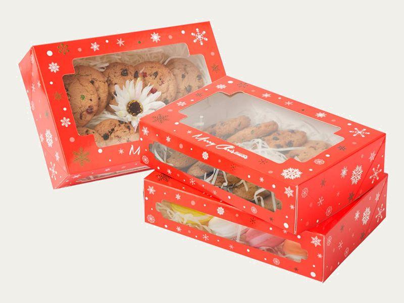
Choosing Materials That Help Users
The material of a cookie box affects usability for visually impaired individuals. Smooth or slippery surfaces can be difficult to handle. Textured or firm materials provide grip, making opening and carrying easier. Cardboard or recycled paper with soft coatings works well.
Materials can also communicate information. Raised patterns can represent flavors, making identification simple without sight. For instance, dots could indicate chocolate, and wavy lines could indicate fruit. Such tactile cues are intuitive and help users navigate quickly.
Eco-friendly materials combine sustainability with accessibility. Lightweight, sturdy cardboard is easy to handle and reduces environmental impact. Durability is key, as packaging should maintain tactile features over time. Embossed or debossed textures ensure patterns remain noticeable even after repeated use.
Print techniques enhance tactile elements. Spot varnish or embossing creates raised designs that users can feel. Subtle features can convey information without affecting the visual appeal of the box. Consistency in texture and material quality ensures trust and reliability for all users.
Incorporating Braille for Independence
Braille is a critical tool for visually impaired users. Including braille on cookie boxes allows customers to read product names, ingredients, or expiry dates independently. Placement is important; it should be easy to locate and read with minimal movement.
Braille can be combined with tactile borders or patterns to guide fingers. This combination improves accuracy and reduces errors. Proper embossing ensures letters are legible, while testing with users guarantees effectiveness.
Braille integration also reflects a brand’s commitment to inclusivity. Users feel respected and supported. Modern designs allow braille to be incorporated without compromising aesthetics. Subtle placement can maintain a stylish and functional look.
Beyond compliance, braille empowers users and creates equality. Visually impaired individuals can select and enjoy products without assistance. It improves confidence and overall customer experience. Brands adopting braille show that inclusivity is a priority, not an afterthought.
Using Colors to Guide the Eye
High-contrast colors make packaging easier for partially sighted users. Light backgrounds with dark text or bright icons on muted surfaces improve readability. Color can also act as a quick identifier for different flavors or product types.
Simple color schemes are more effective than complicated patterns. Clear, bold visuals reduce confusion and make information easy to find. High-contrast designs are helpful in dim lighting or when boxes are inside bags or shelves.
When combined with tactile features and braille, color enhances usability. Multiple cues ensure users can identify products independently. Inclusive packaging should not only be functional but visually appealing as well.
Designing Boxes That Are Easy to Hold
The shape and size of a box affect how users interact with it. Rounded edges, easy-to-lift lids, and manageable dimensions make handling effortless. Ergonomic design reduces strain and increases comfort.
Predictable box shapes help visually impaired users handle products safely. Tabs, sliding lids, and pull-out trays simplify access while protecting cookies. Grip-friendly surfaces and finger grooves further improve usability.
Consistency in box design allows users to develop familiarity. Muscle memory makes opening and closing simpler over time. A balance between aesthetics and ergonomic functionality ensures inclusivity and attractiveness.
Visual Icons for Quick Information
Icons are effective tools to communicate product information. Simple symbols for flavor, ingredients, or dietary preferences make identification faster.
- Icons help users recognize products quickly
- They differentiate flavors and ingredients
- Allergy alerts become easier to spot
- They support tactile and braille features
Icons combined with tactile elements create a multi-sensory experience. Users can rely on touch, sight, and symbolism, improving safety and efficiency.
Tactile Designs for Flavor Recognition
Different textures allow users to identify flavors without relying on sight. Embossed patterns can represent chocolate, vanilla, or fruit. Consistent, clear patterns improve recognition and reduce mistakes.
User testing ensures patterns are intuitive and distinguishable. Subtle or confusing textures may fail. Tactile designs also add brand value by making the product more memorable and interactive.
Even simple embossing or debossing can provide effective cues. Thoughtful planning guarantees usability while maintaining design appeal.
Combining Sustainability and Accessibility
Sustainable materials like recycled cardboard or biodegradable plastics meet eco-conscious goals while remaining user-friendly. Lightweight and durable materials are easier to handle and maintain tactile features.
Accessible and eco-friendly packaging enhances brand reputation. Customers appreciate companies that care for both people and the environment. Thoughtful, inclusive designs show innovation, social responsibility, and consideration for all users.
How Printed Cookie Boxes Support Inclusive Design
Printed cookie boxes can integrate all accessibility features in one package. They can include braille, tactile patterns, high-contrast visuals, ergonomic shapes, and clear icons. These features help visually impaired users identify, open, and enjoy cookies independently.
Investing in inclusive packaging is a commitment to empathy and usability. It ensures independence, improves safety, and strengthens brand loyalty. Inclusive printed cookie boxes create a meaningful experience for all users while setting a high standard for thoughtful product design.
Final Thoughts
Inclusive packaging is no longer optional; it is essential for creating products that everyone can enjoy. For visually impaired individuals, small design changes make a big difference in independence, safety, and overall experience. Accessible cookie boxes with tactile patterns, braille, ergonomic shapes, high-contrast colors, and clear icons ensure that all users can identify, open, and enjoy their treats confidently.
Brands that invest in inclusivity show empathy, innovation, and social responsibility. Combining accessibility with sustainability adds even more value, creating packaging that is both environmentally conscious and user-friendly. Thoughtful design not only benefits customers but also strengthens brand reputation and loyalty.
Printed cookie boxes serve as an excellent example of how inclusive design can be implemented in everyday products. By focusing on the needs of visually impaired users, businesses can create packaging that is functional, attractive, and equitable. Ultimately, accessibility in packaging is a meaningful step toward a more inclusive world, ensuring everyone can enjoy the little joys of life, like a simple cookie, independently and confidently.
Source Link: https://ibexpackaging.com/custom-cookie-boxes/